Whether it’s McDonald’s golden arches, the Nike “swoosh,” Starbucks’ green siren, or red-and-white Spencerian script spelling out “Coca-Cola,” logos are all around us. For-profit companies use logos to ensure customers immediately recognize their products and build a sense of trust around their brand.
Nonprofits can also benefit from having well-designed logos. This key element of your brand differentiates your organization from others and helps your audience immediately understand your mission and impact. Plus, as supporters become more familiar with your logo, a similar sense of trust develops as with for-profit brands, leading to your organization developing stronger supporter relationships over time.
In this guide, we’ll examine three examples of impactful nonprofit logos to determine their strengths. Then, we’ll provide practical tips for how your organization can get started designing your own logo. Let’s dive in!
3 Top Examples of Nonprofit Logos
According to Loop, one of the best ways to develop your nonprofit’s brand is by drawing inspiration from other impactful organizations. To provide some ideas for your logo design, let’s walk through three of the best nonprofit logo examples.
1. WWF
The mission of WWF (formerly World Wildlife Fund) is “to conserve nature and reduce the most pressing threats to life on earth.” As the world’s leading conservation nonprofit, WWF has operated for more than 60 years and now works in nearly 100 countries.
WWF’s logo stands out among nonprofit brands for several reasons:
- It centers the organization’s impact. One of WWF’s main goals is to protect endangered and threatened species in the wild, so the logo depicts a recognizable vulnerable animal—the giant panda.
- It’s simple but coordinated. This logo features only two colors—black and white—but that simplicity is memorable. Plus, this color scheme and the font used for the WWF letters remains consistent throughout the organization’s marketing materials.
- It has evolved slightly over the years, but it’s still recognizable. Since the panda first appeared in 1961, the drawing has become more streamlined as pictured below, and additional versions have been developed that include the letters WWF. These changes have allowed the logo to capitalize on the latest design trends so their mission can shine through even more effectively.
By designing their logo to resonate with their audience throughout the years, WWF has developed one of the most iconic nonprofit logos in the world.

2. Teach for Canada
Teach for Canada’s goal is to make education more equal throughout Canada by recruiting and equipping teachers in First Nations communities. The organization’s unique position and diverse audience heavily influence its branding strategy.
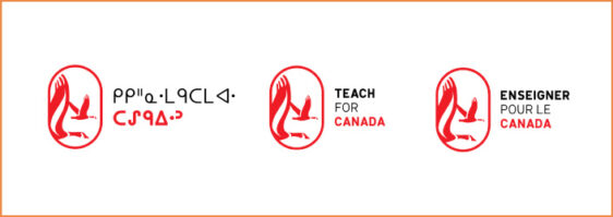
The first thing you’ll notice about Teach for Canada’s logo is its bright red color. This choice reflects the passion and boldness of the teachers and community leaders who are dedicated to improving the education system, besides making the logo stand out.
Teach for Canada designed their logo with their audience in mind by incorporating audience input. Nonprofit leaders quickly realized that the logo had to appeal to three distinct audience segments: English speakers, French speakers, and speakers of the Ojibwe language. So, there are three versions of the design, one in each language. They also consulted with teachers and community members to develop imagery that would allow the logo to accurately represent the First Nations communities they serve.

3. Oxfam
Oxfam describes themselves as a “global movement of people who are fighting inequality to end poverty and injustice.” Founded in Britain, Oxfam now works in more than 70 countries.
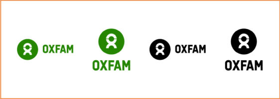
The most noticeable characteristic of the Oxfam logo is its unique shape. If you look closely, it contains the letters O and X like the organization’s name. But from a distance, it resembles a person, which is appropriate for a people-centered nonprofit. Oxfam also uses a distinctive green color for this shape to represent its strategically growing movement.
Additionally, Oxfam’s logo was designed for versatility. The organization has stipulated that the logo can be used in a horizontal or vertical format, and that a black-and-white version is acceptable in addition to their signature green. This way, the logo can fit naturally into the design of any print or digital marketing content.

Tips to Design Your Nonprofit Logo
Now that you’ve seen what makes a nonprofit logo great in practice, it’s time to start designing your own logo! Before you dive in, take some time to consider how you want your logo to reflect your organization’s mission statement. Then, refer to these tips to start developing your logo design..
Choose Your Typography and Colors Carefully
Most logos include a combination of typography and imagery, unified by a color scheme. When choosing the font for your organization’s name or initials, make sure it’s legible. You can experiment with creative typography if you’d like, but your name should be clear so supporters know exactly what your logo represents.
There’s no agreed-upon number of colors you should use in your logo—just make sure the colors you choose complement each other and don’t look cluttered. Because color psychology applies heavily to branding, many nonprofits also choose logo colors that speak to their mission or values. For example:
- Red represents passion and strength, and it’s a favorite color of healthcare organizations.
- Green is popular for environmental causes because it’s associated with growth and prosperity.
- Blue has a wide range of meanings, including peace, wisdom, trust, and professionalism.
- Black tends to represent serious causes, such as organizations that respond to crises.
A best practice for nonprofit design is to create a brand guide that details your organization’s typography choices, color scheme, and unified logo design. Anyone who works on your nonprofit’s branding will have a reference document to ensure consistency.
Adapt Your Logo for Different Marketing Channels
Once you’ve chosen the basic colors and typography for your logo, create a few design iterations to ensure you can fit your logo into each of your nonprofit marketing materials. Include examples in your brand guide of logo use cases for the following marketing channels:
- Your website. Include a large logo in the top left corner of each page of your website that links to the homepage, as well as a smaller one in the footer near the copyright to improve the site’s credibility.
- Email. Add your logo to your newsletter and email blast templates so recipients immediately know that the email came from your organization.
- Social media. Set your logo as your profile picture on each of your organization’s social media profiles and add an appropriately-sized version to any graphics you post. This way, when supporters share your posts, they’ll spread awareness of your brand.
- Direct mail. Create a black-and-white version of your logo to make it easier to incorporate into printed content.
If your organization has multiple chapters or branches, ensure your logo can also be adjusted to include each chapter’s name. Share the use cases you’ve developed with every chapter so they also know how to use their modified logo in their marketing materials.
Ask Your Supporters for Feedback on Your Logo
Lastly, your supporters are a great resource to rely on as you design your logo. Your logo needs to appeal to them, so applying their input to your design can make it more effective. As an added bonus, Kwala’s guide to donor communications explains that as
king your supporters for feedback about various initiatives (including branding decisions!) makes them feel valued and more likely to continue engaging with your organization.
When you first create your logo, send out a survey to your supporters to gauge their opinions on your nonprofit’s image and values that you can apply to your design. Once you’ve narrowed your ideas down, conduct A/B testing or a focus group with a few dedicated supporters to get their reactions and make your final decision.
After your nonprofit launches your logo design, your work isn’t finished. Continue monitoring audience reactions to your brand and tracking marketing conversions over time. If you notice major changes in this data, it may be time to revisit your logo. By making any necessary design adjustments over time, your logo will always accurately reflect your organization’s impact within the ever-changing nonprofit landscape.