As a nonprofit professional, you know that the core of your organization’s fundraising strategy is your ability to develop an emotional connection with supporters that drives them to give. When you foster genuine relationships built on a shared passion for your mission, you can retain donor support for the long term.
One of the most effective ways to build emotional bonds with supporters is through visual storytelling. You can help audience members learn more about your organization and where donors fit into the picture using compelling images, videos, and other visual content.
In this post, we’re going to review effective examples of online nonprofit visual storytelling, pulled from some of the best nonprofit websites. But first, let’s explore the components that make up compelling nonprofit visual storytelling.
Elements of Effective Nonprofit Visual Storytelling
According to Getting Attention’s nonprofit storytelling guide, visuals can “leave a lasting impression in your supporters’ minds, help people learn, and build your organization’s brand.”
Ensure your visual storytelling achieves these objectives by including the following essential elements:
- Compelling protagonists: Your visual stories should feature real people who have been impacted by your mission. Whether images of volunteers or video interviews with community members who have received support, including compelling protagonists gives a face to your cause. Be sure to ask for permission before capturing images or videos and using them in promotional materials.
- Interactive multimedia formats: Online media can take many forms nowadays, from images and videos to charts, interactive infographics, and timelines. Using a multimedia strategy helps make your visual content engaging and dynamic.
- Uniform branding: A clear brand strategy makes your visual storytelling feel like part of a cohesive narrative. Your message will be more impactful when your stories are clearly aligned with your nonprofit’s overall brand identity. Make sure your photos, videos, and infographics include brand elements like your logo, font, and colors.
- Platform-specific adjustments: You may need to adjust your visual content depending on which platform you’re sharing it. For example, each social media platform has different recommended image sizes to ensure that your images aren’t pixelated or distorted. Ensure your web design strategy is tailored to each online platform, whether social media, email, or your website.
- Mobile-friendliness: Over half of nonprofit website traffic comes from mobile visitors, meaning how your story looks on mobile devices will have a major impact on your ability to connect with your audience. When you couple mobile-friendly visual content with simple mobile giving opportunities, you can maximize your fundraising efforts on this channel.
Consider working with a nonprofit website design agency to help guide your visual storytelling strategy. These professionals can help you determine your most popular online channels, craft your message, and develop compelling content that drives engagement.
5 Nonprofit Visual Storytelling Examples
Let’s take a look at a few different types of nonprofit visual storytelling, what makes each example so effective, and how your organization can implement similar strategies.
1. Children’s Healthcare of Atlanta
Children’s Healthcare of Atlanta (CHOA) makes effective use of video storytelling via the organization’s YouTube channel. Using this platform, CHOA shares stories about kids who have received treatment from the nationally-ranked nonprofit hospital.
Here’s one example of a compelling video story recounting 18-year-old Samerah’s experience with acute liver failure:
This video is so impactful because it features interviews with Samerah, her mother, and her nurse and doctor, letting each individual give their unique perspective to the story. The video also includes a link in the caption to visit the CHOA website to learn more or support the organization.
If your organization is a healthcare-focused nonprofit, patient stories and testimonials can be extremely useful for conveying your mission and explaining the important work you do for your community.
Kanopi’s healthcare website design guide also emphasizes the importance of making your content accessible to all audiences. This means including captions for videos, alternative text for images, sufficient color contrast between text and background, and prioritizing other accessibility considerations. This makes your web content easy to view and navigate for all visitors.
2. Charity: Water
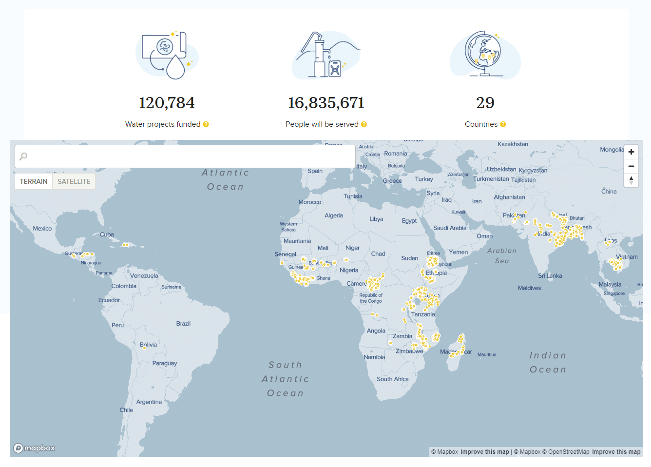
Charity: Water is devoted to bringing clean drinking water to communities all over the world. The global scale of their work can be hard to visualize, but they make it easier to comprehend with an interactive map showcasing their water projects.
Visitors can click on each dot to learn more about the water project at that site, including a photo of the site and how many people it serves. This helps audience members see the real impact of Charity: Water and understand how the organization’s work improves the lives of thousands worldwide.
If your nonprofit’s mission spans the globe, or even a large region, an interactive map can be a great way to display your reach.
3. No Kid Hungry
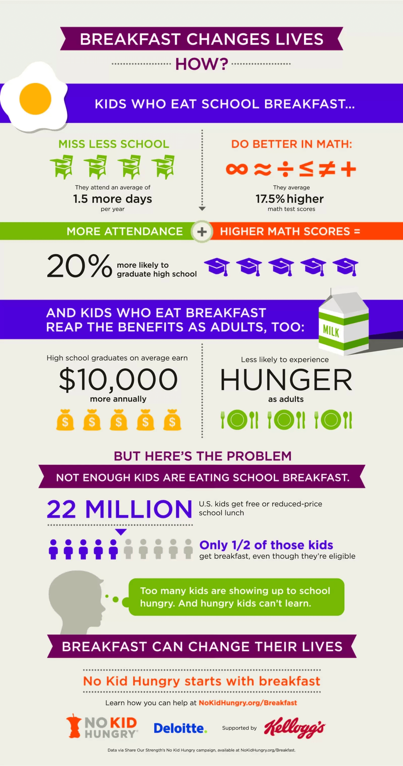
No Kid Hungry’s mission is to end childhood hunger across the United States. They focus much of their efforts on ensuring that kids have access to nutritious breakfasts. The following infographic depicts the importance of breakfast for growing children:
This infographic works because it starts with a bold, attention-grabbing headline that captures the audience’s attention. Then, it clearly lays out the benefits of providing kids with breakfast using a variety of compelling statistics.
Any infographics your nonprofit creates should be branded to your organization and based on accurate statistics and research to help establish your authority and credibility.
4. CARE USA
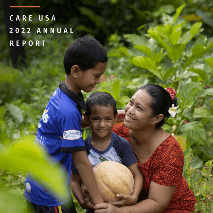
You can incorporate elements of visual storytelling into your nonprofit’s regular reports to make them more engaging for your audience. One effective example of this is CARE USA’s 2022 Annual Report.
The report combines photos and infographics to tell the story of the milestones the organization has reached over the past year. If audience members don’t have the time to read through the text, they can quickly glance over the graphs and maps to get a sense of the progress the organization has made.
5. St. Jude
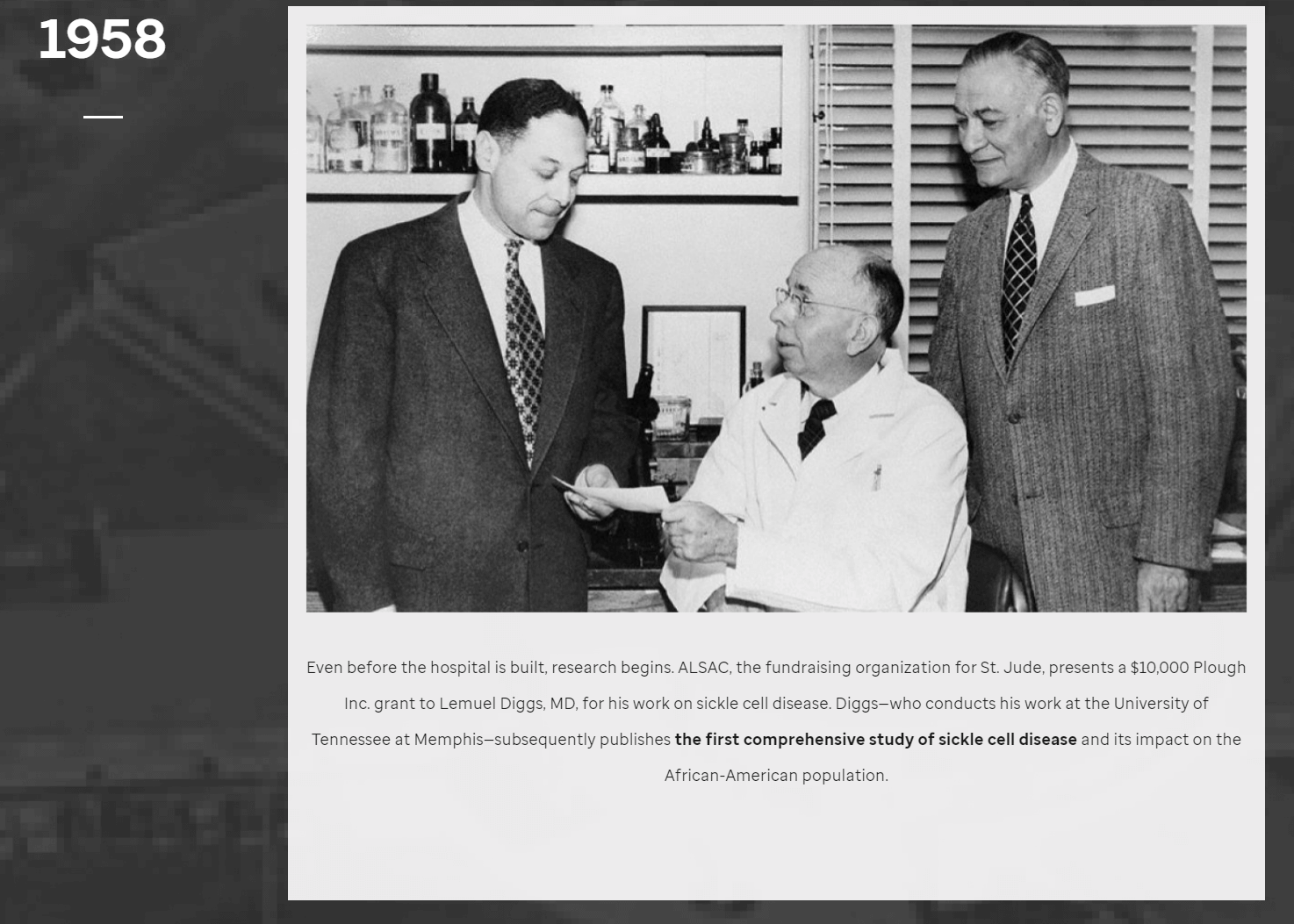
St. Jude Children’s Research Hospital is a pioneer in the field of childhood cancer and other life-threatening diseases. The organization’s rich history is carefully laid out in a visual timeline available on the St. Jude website.
The historic images included in the timeline lend credibility to the organization and emphasize just how long they’ve been devoted to helping children. Large, full-screen images capture visitors’ attention and lend visual intrigue to the written content.
If your organization has a storied history, a visual timeline can be effective for telling your story and emphasizing your long-term commitment to your mission.
As you can see, these examples don’t just use straightforward words and images to tell each organization’s story. You can tell a story in any format, whether a map, timeline, video, or infographic. By using visual content to connect with supporters, you can earn their ongoing support and boost online donations.


